
How to Use Anychart: Ultimate Guide to Stunning Data Visuals
Are you looking for a simple way to bring your data to life? Learning how to use Anychart can transform your boring numbers into clear, engaging visuals that anyone can understand.
Whether you want to create interactive charts for your website or dashboard, Anychart gives you the tools to do it easily and effectively. You’ll discover step-by-step instructions to get started, tips to customize your charts, and tricks to make your data tell a compelling story. Ready to see your data in a whole new way? Let’s dive in and unlock the power of Anychart for your projects. And if you want to enhance your site even more, check out AnyChat — a smart widget that puts all your contact options right where your visitors need them.

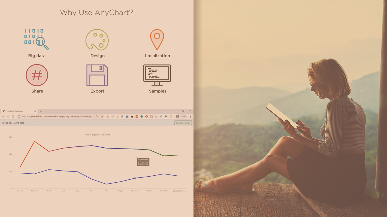
Credit: www.anychart.com
Introduction To Anychart And Its Purpose
AnyChart is a powerful tool designed to help users create clear, interactive charts and graphs. It focuses on making data easy to understand through visual representation. AnyChart suits developers, analysts, and businesses that want to present data effectively on websites and apps.
This section explains what AnyChart is, why it stands out for data visualization, and the types of visuals you can create with it.
What Is Anychart? Overview And Capabilities
AnyChart is a flexible JavaScript charting library. It supports many chart types and works on all modern browsers and devices.
Key capabilities include:
- Wide range of chart types like line, bar, pie, and more
- Interactive features such as zoom, tooltip, and drill-down
- Easy integration with web technologies like HTML, CSS, and JavaScript
- High performance even with large data sets
- Customizable design to match brand styles
AnyChart helps display complex data clearly and attractively. Its versatility fits many industries, from finance to marketing.
Why Choose Anychart For Data Visualization?
AnyChart offers several benefits that make it a preferred choice for data visualization:
- User-friendly: Simple API and clear documentation speed up development
- Cross-platform: Works smoothly on desktops, tablets, and mobiles
- Customizable: Adjust colors, labels, and layouts easily
- Interactive: Engages users with dynamic charts
- Reliable: Strong community support and regular updates
This combination of ease, flexibility, and reliability helps users create effective visual stories from data.
Types Of Visuals You Can Create With Anychart
AnyChart supports many chart and graph types. Here is a quick look at popular options:
| Chart Type | Description | Use Case |
|---|---|---|
| Line Chart | Displays trends over time | Sales growth, stock prices |
| Bar Chart | Compares values across categories | Revenue by region, survey results |
| Pie Chart | Shows parts of a whole | Market share, budget allocation |
| Scatter Plot | Visualizes correlation between variables | Scientific data, quality control |
| Heatmap | Represents data density or intensity | Website clicks, population data |
| Gauge Chart | Measures performance against targets | KPIs, speedometers |
Each chart type can be customized with colors, labels, and animations. This flexibility allows clear communication of different data stories.
Key Features That Make Anychart Unique
AnyChart offers a powerful set of features that make data visualization simple and effective. Its flexibility and ease of use help users create clear, engaging charts. Below are the key features that set AnyChart apart from other charting tools.
Wide Range Of Chart Types And Customization Options
AnyChart supports over 70 chart types, including bar, line, pie, scatter, stock, and maps. This variety covers most data visualization needs.
- Customizable colors, fonts, and labels to match your branding.
- Multiple axes and scales for complex data comparisons.
- Flexible layouts to arrange charts exactly as required.
Users can easily adjust every element to create unique and professional visuals.
Interactive Elements: Tooltips, Crosshairs, And Selection
Interactive features enhance user engagement and data exploration.
- Tooltips display detailed information when hovering over data points.
- Crosshairs help track exact values across the chart.
- Selection and zoom allow users to focus on specific data ranges.
These elements make charts dynamic and user-friendly.
Seamless Integration With Various Platforms And Frameworks
AnyChart integrates smoothly with popular web technologies and frameworks.
| Platform/Framework | Integration Method |
|---|---|
| JavaScript | Native JavaScript API |
| Angular | Angular components |
| React | React wrappers |
| Vue.js | Vue components |
| jQuery | jQuery plugins |
It works well with other tools, making it easy to add charts anywhere.
Robust Api And Data Mapping For Dynamic Visuals
The API offers extensive control over chart behavior and data.
- Easy data binding from various sources like JSON, CSV, or arrays.
- Dynamic updates allow charts to refresh as data changes.
- Advanced data mapping supports complex datasets and relationships.
These capabilities help create live, interactive dashboards.
Responsive Design And Mobile Compatibility
Charts automatically adjust to different screen sizes.
- Responsive layouts ensure readability on smartphones and tablets.
- Touch-friendly controls support gestures like pinch and swipe.
- Fast loading for smooth performance on all devices.
This makes AnyChart ideal for modern, mobile-first projects.
How To Get Started With Anychart
AnyChart is a flexible JavaScript charting library. It helps create interactive charts quickly. This guide explains how to start with AnyChart in simple steps. Learn to add AnyChart to your project, prepare data, create charts, and use the online playground.
Setting Up: Including Anychart In Your Project
Start by adding AnyChart to your web project. Use the official CDN link to load the library easily.
Place this script tag inside the or just before the closing tag in your HTML file.
After this, AnyChart functions become available for use in your JavaScript code.
Preparing And Mapping Data For Your Charts
Data is the core of any chart. AnyChart accepts data in arrays or JSON format.
Example of simple data for a bar chart:
var data = [ {x: "Apples", value: 10}, {x: "Bananas", value: 15}, {x: "Cherries", value: 7} ]; Use the x field for categories and value for numbers.
Map your data using AnyChart’s data mapping:
var dataSet = anychart.data.set(data); var mapping = dataSet.mapAs({x: 'x', value: 'value'}); This step connects your data to the chart’s axes and series.
Basic Chart Creation: Step-by-step Guide
- Create a container in your HTML for the chart:
- Initialize the chart in JavaScript:
var chart = anychart.bar(); - Assign the mapped data to the chart:
chart.data(mapping); - Set the container where the chart will appear:
chart.container("container"); - Draw the chart:
chart.draw(); This creates a simple bar chart showing your data.
Using The Anychart Playground For Experimentation
The AnyChart Playground is an online tool to try code instantly.
Visit the playground on AnyChart’s website. It offers:
- Code editor with syntax highlighting
- Live chart preview
- Examples for different chart types
- Easy sharing and saving of your charts
Use it to test data formats, customize styles, and learn chart options.
Experiment freely without setting up a project locally. It speeds up learning and development.
Advanced Customizations And Features
AnyChart offers powerful options for advanced customizations. These features let you create unique, interactive, and high-performance charts. Tailor your visuals and improve user experience with ease.
Custom Drawing And Theming For Unique Visual Styles
Customize charts with custom drawing to create distinct visuals. AnyChart supports drawing shapes, lines, and text directly on the chart canvas. This allows branding or highlighting specific data points.
Theming helps maintain a consistent look across all charts. Use built-in themes or create your own color palettes, fonts, and styles. This ensures charts fit your website or app design perfectly.
- Adjust colors, fonts, and background styles.
- Add logos, icons, or custom shapes.
- Apply gradients and shadows for depth.
// Example: Applying a custom theme anychart.theme('darkTheme', { palette: { items: ['2ecc71', 'e74c3c', '3498db'] }, defaultFontFamily: 'Arial, sans-serif' }); anychart.theme('darkTheme');Adding Interactive Features To Enhance User Engagement
Interactive charts improve user engagement by allowing data exploration. AnyChart offers:
- Tooltips that show details on hover.
- Zooming and panning for closer data inspection.
- Clickable elements that trigger events or link to more info.
Interactivity helps users understand data better. It also makes charts more dynamic and responsive.
// Example: Enabling zoom and tooltip chart.tooltip().enabled(true); chart.interactivity().zoom(true);Integrating Anychart With Javascript Frameworks And Android
AnyChart works smoothly with popular JavaScript frameworks like React, Angular, and Vue. Embed charts easily within component structures.
Integration steps:
- Install AnyChart via npm or CDN.
- Import and initialize charts in your component.
- Bind data dynamically using framework state or props.
AnyChart also supports Android development. Use its JavaScript API inside WebView or native wrappers to display charts in apps.
| Platform | Integration Method | Key Benefit |
|---|---|---|
| React | npm package, JSX components | Reusable chart components |
| Angular | Directives, TypeScript imports | Two-way data binding |
| Vue | Vue components, reactive data | Easy state management |
| Android | WebView with JS API | Native app chart display |
Optimizing Performance For Large Datasets
Handling large datasets requires careful optimization. AnyChart provides techniques to keep charts fast and smooth:
- Data sampling: Reduce data points without losing trends.
- Lazy loading: Load data in chunks on demand.
- Hardware acceleration: Use canvas rendering for speed.
- Asynchronous data processing: Avoid UI blocking.
These methods prevent slowdowns and ensure smooth interaction.
// Example: Enabling canvas rendering for performance chart.renderer('canvas');Pricing And Affordability Breakdown
Understanding AnyChart’s pricing helps plan your budget clearly. The tool offers different licensing options suited to various needs. This section breaks down pricing models, compares free and paid plans, and highlights cost-effectiveness.
Overview Of Anychart Licensing Models
AnyChart provides flexible licensing for individuals and businesses. The main models include:
- Free License: Limited features with basic charting capabilities.
- Commercial License: Paid plans with full access and support.
- Enterprise License: Custom pricing for large organizations with advanced needs.
Each license type targets different user groups, from beginners to large companies.
Comparing Free Vs. Paid Plans: Features And Limitations
| Feature | Free Plan | Paid Plan |
|---|---|---|
| Number of Chart Types | Basic set | Full range |
| Commercial Use | Not allowed | Allowed |
| Customization Options | Limited | Advanced |
| Technical Support | Community only | Priority support |
| Updates and Upgrades | Basic updates | Regular updates |
The free plan suits learning and simple projects. Paid plans unlock full features and commercial rights.
Cost-effectiveness For Different User Types And Business Sizes
AnyChart offers value across users and businesses:
- Individual Developers: Free plan helps start small projects.
- Small Businesses: Paid plans provide more features at a reasonable price.
- Large Enterprises: Enterprise licensing supports complex needs with custom pricing.
Choosing the right plan depends on your project scope and budget.
Paid licenses often save costs by offering comprehensive tools and support. This reduces development time and improves outcomes.
Credit: www.pluralsight.com
Pros And Cons Based On Real-world Usage
Anychart offers a powerful solution for data visualization. Users praise its flexibility and rich features. Yet, some face challenges with its learning curve and integration. This section breaks down the real-world strengths and limitations. It also shares common user feedback and outcomes.
Strengths: Flexibility, Support, And Feature-rich Toolkit
Anychart stands out for its flexible charting options. It supports many chart types like bar, line, pie, and more. Users can customize charts deeply to fit their exact needs.
- Flexibility: Works well with different data formats and platforms.
- Support: Offers clear documentation and active community help.
- Feature-Rich Toolkit: Includes interactive elements, responsive design, and export options.
This makes it suitable for various industries and data visualization tasks.
Limitations: Learning Curve And Potential Integration Challenges
New users often find Anychart’s learning curve steep. Understanding all customization options takes time and effort. Beginners may need extra tutorials or help.
Integration with some platforms can pose challenges. Complex projects might require additional coding or adjustments.
| Limitation | Description |
|---|---|
| Learning Curve | Requires time to master chart customization and API usage. |
| Integration | May need extra setup for smooth operation with certain systems. |
User Feedback And Common Use Case Outcomes
Users appreciate Anychart for creating clear, interactive charts quickly. Many report improved data presentation in reports and websites.
- Marketing Teams: Use Anychart to track campaign results visually.
- Developers: Value the toolkit for embedding charts in apps.
- Educators: Create simple visuals for teaching data concepts.
Common feedback points to the need for patience during the initial learning phase. Once familiar, users find the product reliable and versatile.
Who Should Use Anychart?
AnyChart is a versatile JavaScript charting library designed for clear and interactive data visualization. It suits a variety of professionals who need to present data effectively. Understanding who benefits most from AnyChart helps in making the right choice for your projects.
Ideal Users: Developers, Data Analysts, And Business Intelligence Teams
Developers use AnyChart to embed customizable charts into websites and applications. The library supports numerous chart types and integrates with popular frameworks. Its flexible API allows developers to create tailored visualizations with ease.
Data Analysts rely on AnyChart to transform raw data into meaningful insights. The tool offers interactive and dynamic charts that help identify trends and patterns clearly.
Business Intelligence Teams benefit from AnyChart by building dashboards and reports. They can present complex data in an accessible way to support decision-making processes.
Best Scenarios For Anychart Implementation
- When you need highly customizable, interactive charts.
- Projects requiring integration with web and mobile platforms.
- When working with large datasets that need dynamic visualization.
- Building dashboards for real-time data monitoring.
- Embedding charts inside business applications or websites.
How To Choose Anychart Over Other Visualization Tools
| Feature | AnyChart | Other Tools |
|---|---|---|
| Customization | Extensive API for deep customization | Limited or preset templates |
| Integration | Works well with JavaScript, HTML5, and frameworks | May require plugins or extra setup |
| Chart Variety | Supports over 90 chart types | Often fewer chart options |
| Performance | Handles large datasets smoothly | Performance may drop with big data |
| Licensing | Flexible commercial licenses | Varies, sometimes costly for enterprise |
Choose AnyChart for projects needing flexibility, wide chart selection, and strong developer support.
Conclusion: Mastering Data Visualization With Anychart
AnyChart offers a clear path to present data in a simple, visual way. This tool helps turn raw numbers into charts anyone can understand. Using AnyChart improves how you share information and find insights quickly. It fits many needs, from business reports to educational projects.
Recap Of Anychart’s Value Proposition
AnyChart is a flexible and easy-to-use charting library. It supports many chart types like bar, line, pie, and more. Its key strengths include:
- Simple integration with websites and apps
- Customizable and interactive charts
- Works well with various data formats
- Responsive design for all devices
These features make AnyChart a solid choice for clear and effective data visualization.
Next Steps To Enhance Your Visualization Skills
Follow these steps to improve your skills with AnyChart:
- Practice creating different chart types using sample data.
- Explore chart customization options like colors and labels.
- Learn to connect charts with live data sources.
- Test your charts on multiple devices to ensure responsiveness.
- Try adding interactive features such as tooltips and zoom.
Consistent practice will build confidence and help you create better visual stories.
Additional Resources And Community Support
AnyChart offers many resources to assist users:
| Resource | Description | Access |
|---|---|---|
| Official Documentation | Step-by-step guides and API details | anychart.com/docs |
| Community Forums | Ask questions and share tips with users | forum.anychart.com |
| Video Tutorials | Visual learning through examples | Search “AnyChart tutorials” on YouTube |
Joining the community helps solve problems and discover new ideas fast.
Credit: www.anychart.com
Frequently Asked Questions
How Do I Put Data In A Chart?
To put data in a chart, open the chart tool and select the data source. Highlight the cells with your data. The chart updates automatically with the selected data. Adjust data ranges anytime to include new information. Save your chart once data input is complete.
How Do We Use A Chart?
Use a chart by selecting relevant data, choosing the chart type, and interpreting visual patterns to understand information quickly.
Can I Make A Chart On My Phone?
Yes, you can create charts on your phone using apps like Google Sheets. Simply open a spreadsheet, select data, and choose a chart type. Many mobile apps offer easy chart creation and editing features for quick data visualization on the go.
How To Make A Chart Step By Step?
Select your data set in a spreadsheet or software. Choose the chart type. Insert the chart. Customize labels and colors. Review and save your chart.
Conclusion
Using Anychart simplifies creating clear, engaging charts for your website. You can easily add various chart types to display your data effectively. The tool fits well with different web projects and helps visitors understand information faster. Try adding the AnyChat widget for smooth contact options on every page. This enhances user interaction without clutter. Explore how this integration boosts your site’s usability by visiting AnyChat. Start improving your site’s data visuals and communication today.